It is easy to come up with a sign or a logo with the availability of apps and programs out there. Nowadays, the only thing you have to do is press a couple of buttons and work on it for a couple of minutes! However, these photos show us that not everyone has what it takes to design that works as desired. These design mishaps will show you why it is a good idea to rely on a professional’s services instead. Trust us. It is going to be worth the money that you spend!
These Design Fails Will Show You Why It Is A Good Idea To Hire A Professional Instead
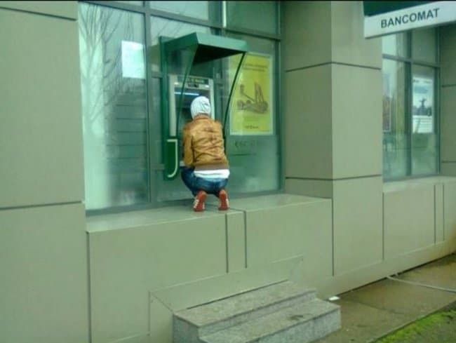
There Is No Need To Say It Thrice
To be honest, we are a little confused here. After all, did they really have to say it three times? You can already see the big “Food Mart” in blue, so why did they feel the need to tack it on two more times? We have no idea. The only person that we can possibly blame here would be Anna.
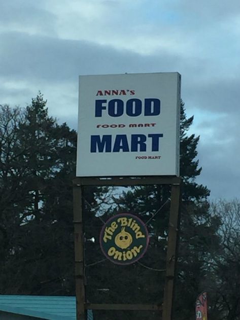
There Is No Need To Say It Thrice
It Is Not For Everyone
It is true that we all need to exercise and move our bodies every now and then. In this day and age, we are all so used to convenience. This sign wants to encourage people to use the stairs instead of the elevator. However, they should have kept in mind that this piece of advice does not apply to all of us.
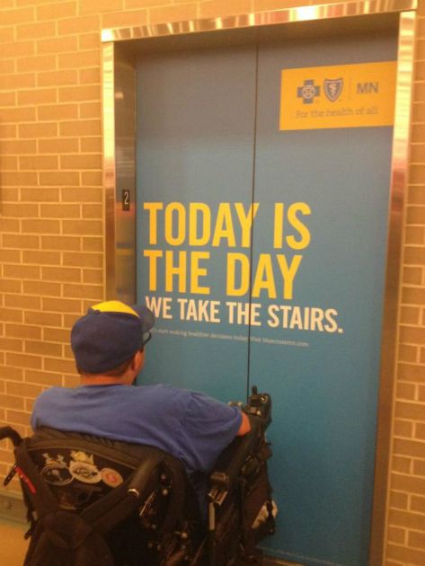
It Is Not For Everyone
No Privacy For You
We do not know what is going on here. To be honest, we do not even know if we want to know. This toilet is placed right in front of several rows of chairs. Who is meant to perform? Who is meant to watch? We have so many questions for the people who came up with this design.
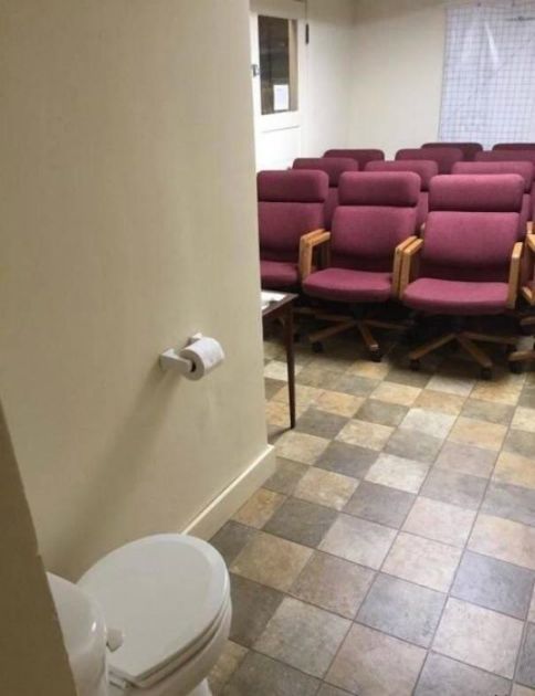
No Privacy For You
The Hood Stays Up
Some people get very emotional about certain causes. We like the fact that she was an animal lover and wanted everyone to know, but this hoodie could still be improved. After all, you will have to wear it with the hood up every single time. Otherwise, you would advocate for the exact opposite thing. Oops.
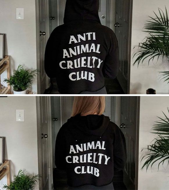
The Hood Stays Up
The Worst Place For A Drain
You usually put a drain so that flooding won’t occur. As you can see in this photo, the people who put it there did not give it much thought. The drain was pretty much useless since it was located at the highest point of the street. It is unable to drain water for this reason. They should have just saved their money.
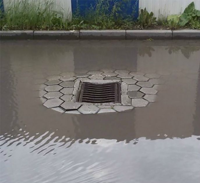
The Worst Place For A Drain
It Is Totally Out Of Order
Can you imagine going inside an elevator and finding this? At a glance, you might think that there is nothing wrong with this. However, you will start to feel confused once you look down. What on earth is the number “6” doing at the corner? If this is a new kind of feng shui, we really do not dig it.

It Is Totally Out Of Order
There Are Too Many Hands
Stock images are typically used in memes because they can get weird. Take a look at this photo to see what we mean. If you do not pay much attention, you would think that this is a normal couple on a shopping truth. You might want to look closer. Whose hands are those and why are they on her waist?

There Are Too Many Hands
Just Your Face And Nothing Else
He wanted to get a billboard space to promote his services. This was his intention, but the execution did not meet his expectations. It looks like the printer messed up the formatting of the image. For some reason, they still decided to go ahead and print it. We just hope that he was able to ask for a refund.

Just Your Face And Nothing Else
Not What It Looks Like
If you are a graphic designer, you must know how important the font is. After all, there are times when some words look like something else. They wanted to say, “click. pick. delivered.” Sadly, the unfortunate choice of font style made this look like something else altogether. A single letter can change a lot of things.

Not What It Looks Like
Far Too Big For Your Wrist
They clearly did not give much thought to this logo. Do you need us to explain it to you? This made it to the list because of the size of the hand. Wristwatches, by definition, are supposed to go on your wrist. For some reason, the photo made it look more like a belt instead of a watch. Look out, Apple!

Far Too Big For Your Wrist
If You Were In A Car
There are many ways to bring attention to certain elements of a text. For one thing, you can rely on color. It is truly eye-catching when you put something in a striking color. However, you should not forget to consider the order of the words as well! As you can see, you might send out the wrong message.

If You Were In A Car
This Is Nightmare Fuel
We can only guess what happened to this statue. From the looks of things, the head of the baby Jesus probably fell off. However, why on earth did they decide to replace it with this? Honestly, we are at a loss for words here. This is the sort of thing that you would see in a horror flick.

This Is Nightmare Fuel
Righties Rule The World
To be honest, we do not blame you if you do not understand what went wrong here. After all, there are indeed two hands here. However, the problem lies in the fact that they are both images of the right hand. We all know that righties already rule the world, and this is just further proof of it.

Righties Rule The World
Less Romantic And More Morbid
We know what you are thinking. Just to be clear, this was not the aftermath of a double homicide. The truth is that the designer of the bed sheets wanted to make linen with red roses. How romantic, right? Sadly, the product did not match what they originally had in mind. The flowers looked like blood instead.

Less Romantic And More Morbid
It Does Not Work Like That
There is nothing wrong with the first one. After all, the ring is a perfect substitute for the letter “O.” The problem begins when they start using it for other letters as well. We are sure that they are trying to spell “marriage” and “baby.” Sadly, the execution made it look more like “morriage” and “boby.”

It Does Not Work Like That
That Is A Crappy Wallpaper
Well, the perfect way to describe this wall would be “crappy.” We seriously can’t believe that someone thought this was a great way to decorate the bathroom. The streaks on the wall would have been fine if they were a bright color. They went with brown, which looks like a different thing found in the toilet.

That Is A Crappy Wallpaper
Not Paris But Aaris
Here is another letter substitution that simply did not work. It is true that most people think of the Eiffel Tower when they hear of Paris. However, they should have used it for the second letter instead. The structure looks just like an “A”. We are sad to say that it did not work quite as well for P. C’est la vie!

Not Paris But Aaris
It Could Have Worked
The sad thing about this is that there is nothing wrong with the design in and of itself. If they had simply separated the two stickers, they should have been all set. Unfortunately, they decided to put them up together. That is the reason it now looks like they wanted to tell people “Sasa Lele” instead.

It Could Have Worked
This Could Still Use Some Work
This is just sad. When you make a book, the readers will assume that you are an expert on the topic. We could have given it a pass if this cover was used for something else. Since its topic is graphic design, there is no way that we can overlook it. We feel like someone else could have done a better job of it.

This Could Still Use Some Work
Too Long, Didn’t Read
If you take the time to read the message, you are going to see that they had good intentions. However, that is exactly where the problem comes from. Who has the time to read an entire block of text when they are on the road? This might cause a car crash when it is trying to stop accidents from happening.

Too Long, Didn’t Read
Cute But Inappropriate
All right, this is actually really cute. Even so, that does not make it super appropriate. This hippo was a fun way to add more character to the bowling alley. It even has an adorable little smile on its face! The way we look at it changed once we realized that it is basically pooping out the balls.

Cute But Inappropriate
Harry Potter And Hannah Montan
There are a couple of things wrong with this bag. For one thing, they spelled “Hannah Montana” wrong. The designer skipped the last letter, which ruined the rhyme of the name. Aside from that, the photo below shows Harry Potter. In fact, there are three of him here! What on earth were they thinking?

Harry Potter And Hannah Montan
Too Close For Comfort
What do you do when you can’t catch a wink of sleep at night? It is a good idea to head to the bathroom and take some sleeping pills. Sadly, it would be way too easy to get these two bottles mixed up. Trust us, a colon cleanser is not going to help you with your insomnia no matter how much they look alike.

Too Close For Comfort
Not The Best Marble Design
Marble is a good way to add a touch of elegance to your bathroom. However, they are not all built the same. In our humble opinion, there are certain designs that will suit the sink even better. This is not it, guys. After all, it will only make your bathroom look even dirtier. We are sure that you don’t want that.

Not The Best Marble Design
There Are So Many Things Wrong Here
There are so many things wrong with this ad. Why on earth are you bringing your kid to a construction site? If you ask us, that is not even the worst part of it all just yet. Aside from the child possibly losing a hand, he should be using a framing hammer instead. We are just glad that he has a hard hat on.

There Are So Many Things Wrong Here
Google Translate Is Not Always Right
Google Translate is there, so why should you bother to pay for a translator. If this was what you thought, we want to show you proof that it is not always correct. It looks like the designers did not speak even a lick of English. After all, they would probably have figured out what went wrong here otherwise.

Google Translate Is Not Always Right
Cyborg Babies Are Coming
Most people in the world can’t help but swoon over babies. This is why they can make for such great models. However, you should probably consider the placement of the poster as well. We do not know what they are trying to advertise here, but we doubt that they wanted to show a cyborg baby.

Cyborg Babies Are Coming
The Importance Of A Single Word
It is not uncommon for toilets to be split between genders. There is typically an extra toilet reserved for people with disabilities and the like. This is a special one, however. You can only use it if you are a disabled elderly pregnant child. The sign only goes to show us that the word “or” is very important.

The Importance Of A Single Word
The Most Ironic Of Them All
We know just how ironic this looks. However, we might be in the wrong here. It is true that this looks funny from the outside, but who said that those people were the target audience of this ad? They are experts, so they must know what they are doing. Maybe this ad was for the people inside the room.

The Most Ironic Of Them All
Not The Name Above All Names
Wow, this is actually really funny. There is nothing wrong with the logo, the message, and the color they used. All in all, this was quite well-done. However, the placement is where they went wrong. They wanted to say that Jesus is a name above all names when we can all see that it is right below “Allison.”

Not The Name Above All Names
This Does Not Make Sense
First of all, we want to say that the message behind this is amazing. After all, we are going to support anyone or anything that supports inclusivity and acceptance. We just wish that this made sense. After all, this came from an airline. It is important to buckle up on a plane, so this does not make any sense.

This Does Not Make Sense
Something Is In The Way
Most of the time, ads have numbers that you can call if you are interested in the service. There is one here for that very purpose. At first, it is easy to assume that you can just lift the backpack to see the contact information in its entirety. Sadly, it was actually a stock photo that was there for some reason.

Something Is In The Way
Hard Pass On Moldy Bread
When you design packaging, it is easy to simply pepper the cover with the logo. After all, this is a good way to ensure that people will remember the name of the brand. However, they should have gone with a different color for this one. The green logo only makes the bread look moldy and unappetizing.

Hard Pass On Moldy Bread
As Loudly As You Can
This one makes us want to scratch our heads. What is going on here? We have no idea what the person who wrote it had in mind. Emergency exits are used in case of fires, earthquakes, and the like. When those things happen, you should probably wake up every single person on the floor. The request to quietly close this door does not make sense to us.

As Loudly As You Can
The Arms Do Not Glow
Just so you know, things that glow in the dark are not only cool when you are in middle school. They can actually be very practical. After all, a clock like that would come in handy at night. However, this one is pretty useless. You might be able to see the numbers, but the arms are even more important.

The Arms Do Not Glow
Not Ideal For Sleeping
It is not a secret that long-distance relationships are hard. They take a lot of hard work, especially if you want things to work out between you. This pillow was made with the intention of bridging the distance. However, it is quite confusing. When you go to bed, isn’t it better to have all the lights off? Weird.

Not Ideal For Sleeping
Beef Chunks Outdoors
No, you are not looking at a photo of beef slices. This is actually a set of pink marble outdoor furniture pieces. How strange is that? In our opinion, this does not look like a good place to relax at all. If we find this on your patio, we are going to have to assume that you are Hannibal Lecter.

Beef Chunks Outdoors
The Sample Test Is Still There
This is the sort of thing that your grandmother will love. However, you should always take a good look at something before you bring it home with you. After all, they forgot to get rid of the “sample text” on it. We can forgive you if you have bad sight, but this is all on you otherwise.

The Sample Test Is Still There
No One Knows If It Is Dirty Or Not
Why would anyone want to buy this? It looks dirty, we know. Some people will probably like the fact that no one can tell if this was dirty or not. We doubt that your guests will appreciate it, however. If you are going to hold a dinner party, you should probably use a different set of dishes.

No One Knows If It Is Dirty Or Not
Use Plus Size Models Next Time
Where do we even begin with this one? They were trying to sell clothes for bigger women but decided to use regular models instead. This was a very bad move. We are sure that it was not that hard to look for a plus size model! By pulling a move like this one, they are only alienating their target audience.

Use Plus Size Models Next Time
Terrifying Potato Creature
The makers of these chips wanted us to “eat more potatoes”, but the packaging makes us want to avoid the tubers. Take a look at those alien potato figures up front. Why did they think that it was a good idea to put those drawings there? We are probably going to see them in our nightmares, so thanks for that.

Terrifying Potato Creature
Red On White Is A Bad Idea
Who on earth is going to want to buy this skirt? We have no clue. All we know is that this will make you look like blood is sprouting from your private parts. If that is your sort of thing, we are not judging you. However, do not blame us if people give you weird looks once you have this on.

Red On White Is A Bad Idea
Not A Comforting Sight
Isn’t it annoying when you use the toilet and find that it is wet? The very thought of this gives us the shivers! This is the reason we are totally blown away that anyone would willingly do this to their toilet seat. We have goosebumps just looking at it. If we ever have to use this, you should know that we would rather not.

Not A Comforting Sight